
KISHIGO
Reflecting innovation and leadership.
CLIENT
Kishigo / High Visibility Workwear
ELEMENTS
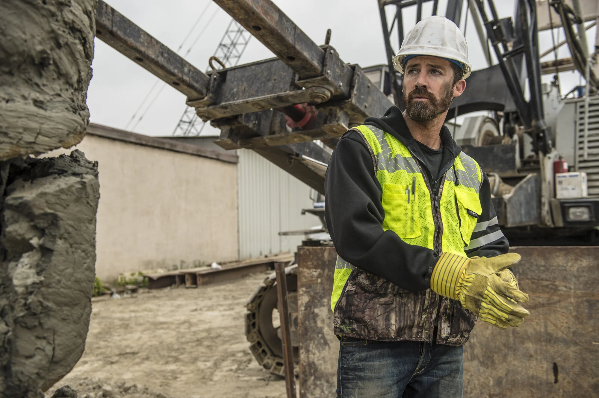
Branding, Website, Copywriting, Booklet, Product & Founder Photoshoot Art Direction, Photography, Product Social Videos
TEAM
Kick and Drive
VIDEOGRAPHY
Randy Ignacio
CHALLENGE
How can we strategically reposition the most trusted name in Visibility Apparel?
For 50 years, ML Kishigo has designed and manufactured high visibility safety apparel that is comfortable and built to last. Over the years, ML Kishigo has expanded quickly, becoming one of the most trusted and recognizable names in the category. With an outdated brand that no longer reflected its brand vision and exponential growth, ML Kishigo commissioned us to refocus their brand strategy and breathe new life into their brand.
TARGET AUDIENCE: RESELLERS, BUYERS, SAFETY MANAGERS AND END USERS

APPROACH
Always on the move.
In collaboration with Kick and Drive, we developed a comprehensive brand strategy and identity inspired by ML Kishigo's continuous drive for setting new standards. ML Kishigo constantly pushes the limits of what is possible by evaluating new materials, testing for durability and thoughtfully considering functionality on the job. Every decision centers around ML Kishigo's pledge to the safety of workers, reflected in its uncompromising commitment to quality, innovation and comfort in every thread and seam.
To support the new focus on innovation, we recommended that "ML Kishigo" change its name to "Kishigo." The change, while subtle, leverages the existing brand equity, while modernizing the name and emphasizing the word "go."
The new logo and branding further build on this strategic decision. The logo mark consists of an arrow (a symbol often seen at construction sites), inspired by Kishigo's never-ending push for innovation and the workers who are always on the move. The significance of "go" extends throughout the new brand identity, from its vibrant neon color palette to its bold use of the positive and negative space of the arrow.


RESULT
We established a fresh brand strategy and identity that reflects Kishigo's uncompromising push for innovation.
Kishigo debuted its new branding in November of 2020.

